Unsupervised learning
Contents
%%html
<!-- The customized css for the slides -->
<link rel="stylesheet" type="text/css" href="../styles/python-programming-introduction.css"/>
<link rel="stylesheet" type="text/css" href="../styles/basic.css"/>
<link rel="stylesheet" type="text/css" href="../../assets/styles/basic.css" />
# Install the necessary dependencies

import os
import sys
!{sys.executable} -m pip install --quiet pandas scikit-learn numpy matplotlib jupyterlab_myst ipython seaborn scipy
43.17. Unsupervised learning#
43.17.1. Outline#
What is unsupervised learning
Dimension reduction
Principal Component Analysis (PCA)
Clustering
K-means
43.17.2. What is unsupervised learning#
Input data are unlabeled (i.e. no labels or classes given)
The algorithm learns the structure of the data without any assistance
It allows us to process large amounts of data because the data does not need to be manually labeled
It is difficult to evaluate the quality of an unsupervised algorithm due to the absence of an explicit goodness metric as used in supervised learning
43.17.3. Dimension reduction#
Can help with data visualization
Can help deal with the multicollinearity of your data and prepare the data for a supervised learning method
PCA, t-SNA
43.17.4. Principal Component Analysis (PCA)#
One of the easiest, most intuitive, and most frequently used methods for dimensionality reduction
Projecting data onto its orthogonal feature subspace
All observations can be considered as an ellipsoid in a subspace of an initial feature space, and the new basis set in this subspace is aligned with the ellipsoid axes
This assumption lets us remove highly correlated features since basis set vectors are orthogonal
We accomplish this in a ‘greedy’ fashion, sequentially selecting each of the ellipsoid axes by identifying where the dispersion is maximal
43.17.5. Quotes from AI giants#
“To deal with hyper-planes in a 14 dimensional space, visualize a 3D space and say ‘fourteen’ very loudly. Everyone does it.” - Geoffrey Hinton
43.17.6. PCA with iris dataset#
%matplotlib inline
%config InlineBackend.figure_format = 'retina'
import pandas as pd
import numpy as np
import matplotlib.pyplot as plt
import seaborn as sns; sns.set(style='white')
from sklearn import decomposition
from sklearn import datasets
from mpl_toolkits.mplot3d import Axes3D
# Loading the dataset
iris = datasets.load_iris()
X = iris.data
y = iris.target
# Let's create a beautiful 3d-plot
fig = plt.figure(1, figsize=(6, 5))
plt.clf()
ax = Axes3D(fig, rect=[0, 0, .95, 1], elev=48, azim=134)

plt.cla()

for name, label in [('Setosa', 0), ('Versicolour', 1), ('Virginica', 2)]:
    ax.text3D(X[y == label, 0].mean(),
              X[y == label, 1].mean() + 1.5,
              X[y == label, 2].mean(), name,
              horizontalalignment='center',
              bbox=dict(alpha=.5, edgecolor='w', facecolor='w'))
# Change the order of labels, so that they match
y_clr = np.choose(y, [1, 2, 0]).astype(np.float)
ax.scatter(X[:, 0], X[:, 1], X[:, 2], c=y_clr,
           cmap=plt.cm.nipy_spectral)

ax.w_xaxis.set_ticklabels([])
ax.w_yaxis.set_ticklabels([])
ax.w_zaxis.set_ticklabels([]);
D:\Temp\ipykernel_24432\3339440331.py:15: DeprecationWarning: `np.float` is a deprecated alias for the builtin `float`. To silence this warning, use `float` by itself. Doing this will not modify any behavior and is safe. If you specifically wanted the numpy scalar type, use `np.float64` here.
Deprecated in NumPy 1.20; for more details and guidance: https://numpy.org/devdocs/release/1.20.0-notes.html#deprecations
  y_clr = np.choose(y, [1, 2, 0]).astype(np.float)
D:\Temp\ipykernel_24432\3339440331.py:19: MatplotlibDeprecationWarning: The w_xaxis attribute was deprecated in Matplotlib 3.1 and will be removed in 3.8. Use xaxis instead.
  ax.w_xaxis.set_ticklabels([])
D:\Temp\ipykernel_24432\3339440331.py:20: MatplotlibDeprecationWarning: The w_yaxis attribute was deprecated in Matplotlib 3.1 and will be removed in 3.8. Use yaxis instead.
  ax.w_yaxis.set_ticklabels([])
D:\Temp\ipykernel_24432\3339440331.py:21: MatplotlibDeprecationWarning: The w_zaxis attribute was deprecated in Matplotlib 3.1 and will be removed in 3.8. Use zaxis instead.
  ax.w_zaxis.set_ticklabels([]);
Now let’s see how PCA will improve the results of a simple model that is not able to correctly fit all of the training data
from sklearn.tree import DecisionTreeClassifier
from sklearn.model_selection import train_test_split
from sklearn.metrics import accuracy_score, roc_auc_score

# Train, test splits
X_train, X_test, y_train, y_test = train_test_split(X, y, test_size=.3,
                                                    stratify=y,
                                                    random_state=42)

# Decision trees with depth = 2
clf = DecisionTreeClassifier(max_depth=2, random_state=42)
clf.fit(X_train, y_train)
preds = clf.predict_proba(X_test)
print('Accuracy: {:.5f}'.format(accuracy_score(y_test,
                                                preds.argmax(axis=1))))
Accuracy: 0.88889
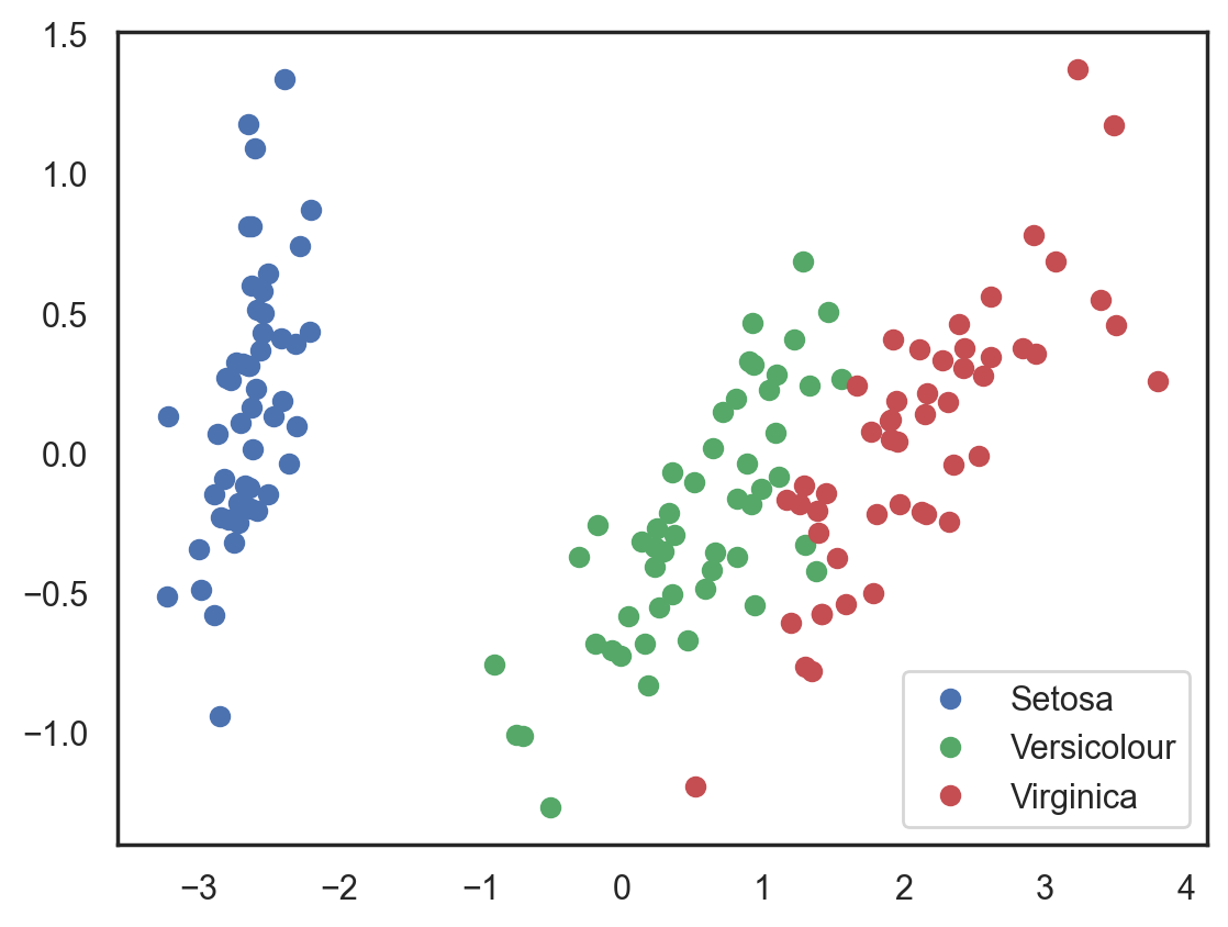
Let’s try this again, but, this time, let’s reduce the dimensionality to 2 dimensions
# Using PCA from sklearn PCA
pca = decomposition.PCA(n_components=2)
X_centered = X - X.mean(axis=0)
pca.fit(X_centered)
X_pca = pca.transform(X_centered)

# Plotting the results of PCA
plt.plot(X_pca[y == 0, 0], X_pca[y == 0, 1], 'bo', label='Setosa')
plt.plot(X_pca[y == 1, 0], X_pca[y == 1, 1], 'go', label='Versicolour')
plt.plot(X_pca[y == 2, 0], X_pca[y == 2, 1], 'ro', label='Virginica')
plt.legend(loc=0);
# Test-train split and apply PCA
X_train, X_test, y_train, y_test = train_test_split(X_pca, y, test_size=.3,
                                                    stratify=y,
                                                    random_state=42)

clf = DecisionTreeClassifier(max_depth=2, random_state=42)
clf.fit(X_train, y_train)
preds = clf.predict_proba(X_test)
print('Accuracy: {:.5f}'.format(accuracy_score(y_test,
                                                preds.argmax(axis=1))))
Accuracy: 0.91111
The accuracy did not increase significantly in this case, but, with other datasets with a high number of dimensions, PCA can drastically improve the accuracy of decision trees and other ensemble methods.
Now let’s check out the percent of variance that can be explained by each of the selected components.
for i, component in enumerate(pca.components_):
    print("{} component: {}% of initial variance".format(i + 1,
          round(100 * pca.explained_variance_ratio_[i], 2)))
    print(" + ".join("%.3f x %s" % (value, name)
                     for value, name in zip(component,
                                            iris.feature_names)))
1 component: 92.46% of initial variance
0.361 x sepal length (cm) + -0.085 x sepal width (cm) + 0.857 x petal length (cm) + 0.358 x petal width (cm)
2 component: 5.31% of initial variance
0.657 x sepal length (cm) + 0.730 x sepal width (cm) + -0.173 x petal length (cm) + -0.075 x petal width (cm)
43.17.7. PCA with mnist dataset#
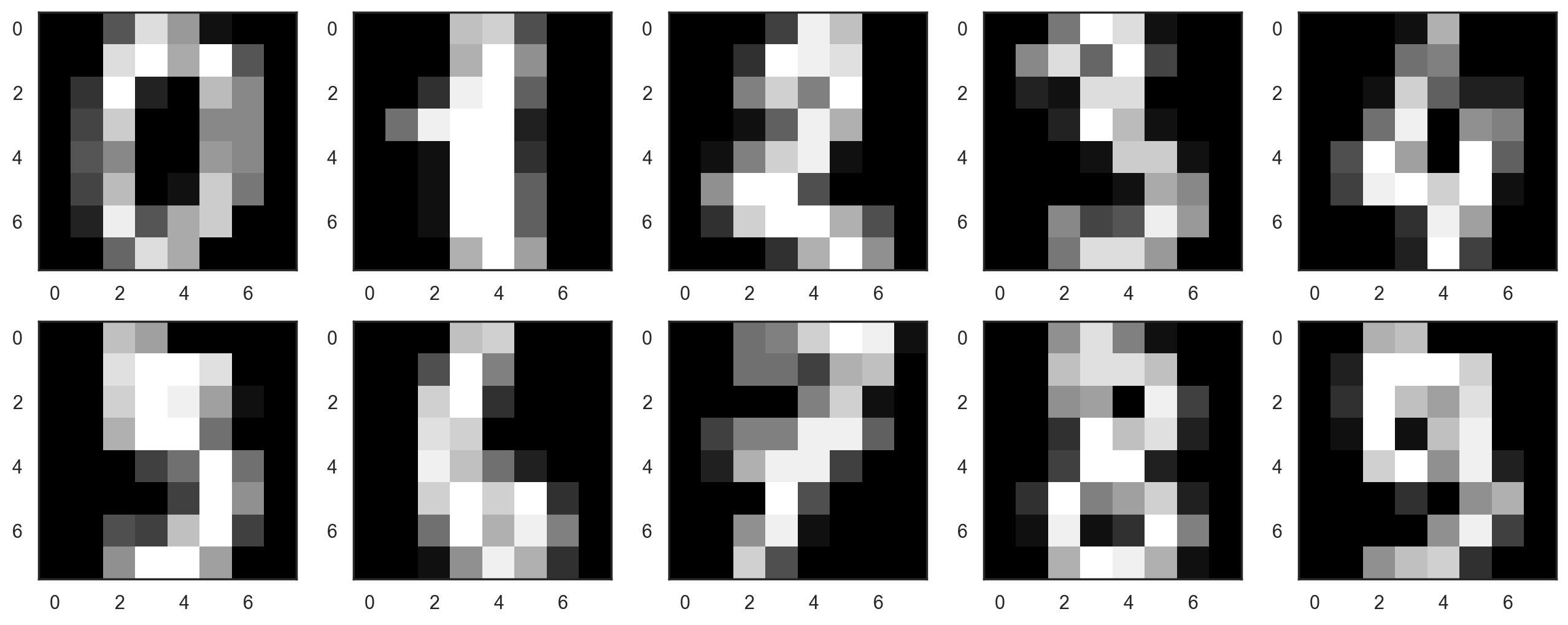
digits = np.genfromtxt('../data/mnist_8x8.csv', delimiter=',', skip_header=1)
X = digits[:, :-1]
y = digits[:, -1]
Let’s start by visualizing our data. Fetch the first 10 numbers. The numbers are represented by 8 x 8 matrixes with the color intensity for each pixel. Every matrix is flattened into a vector of 64 numbers, so we get the feature version of the data.
plt.figure(figsize=(16, 6))
for i in range(10):
    plt.subplot(2, 5, i + 1)
    plt.imshow(X[i,:].reshape([8,8]), cmap='gray');
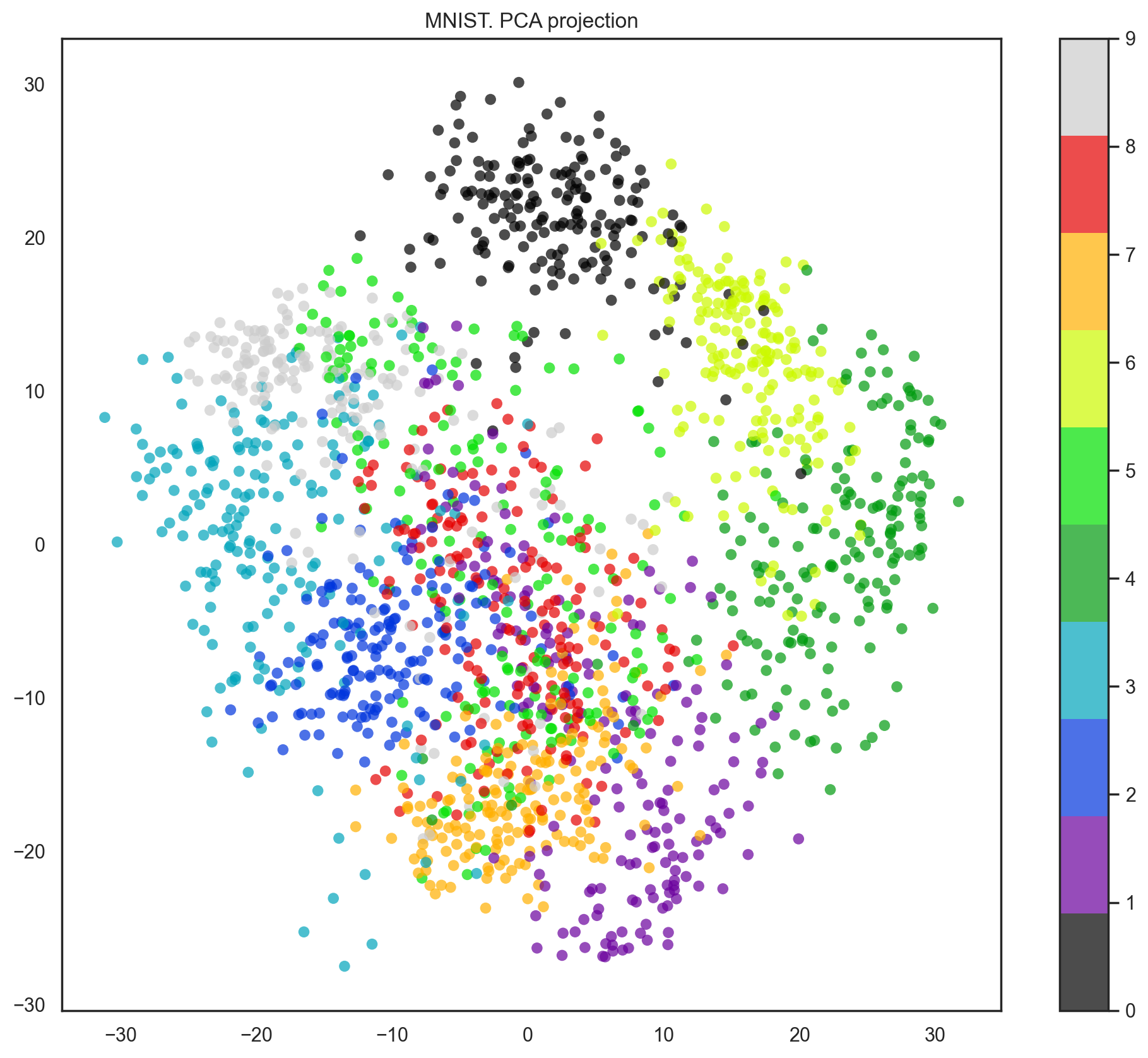
Our data has 64 dimensions, but we are going to reduce it to only 2 and see that, even with just 2 dimensions, we can clearly see that digits separate into clusters.
pca = decomposition.PCA(n_components=2)
X_reduced = pca.fit_transform(X)

print('Projecting %d-dimensional data to 2D' % X.shape[1])

plt.figure(figsize=(12,10))
plt.scatter(X_reduced[:, 0], X_reduced[:, 1], c=y,
            edgecolor='none', alpha=0.7, s=40,
            cmap=plt.cm.get_cmap('nipy_spectral', 10))
plt.colorbar()
plt.title('MNIST. PCA projection');
Projecting 64-dimensional data to 2D
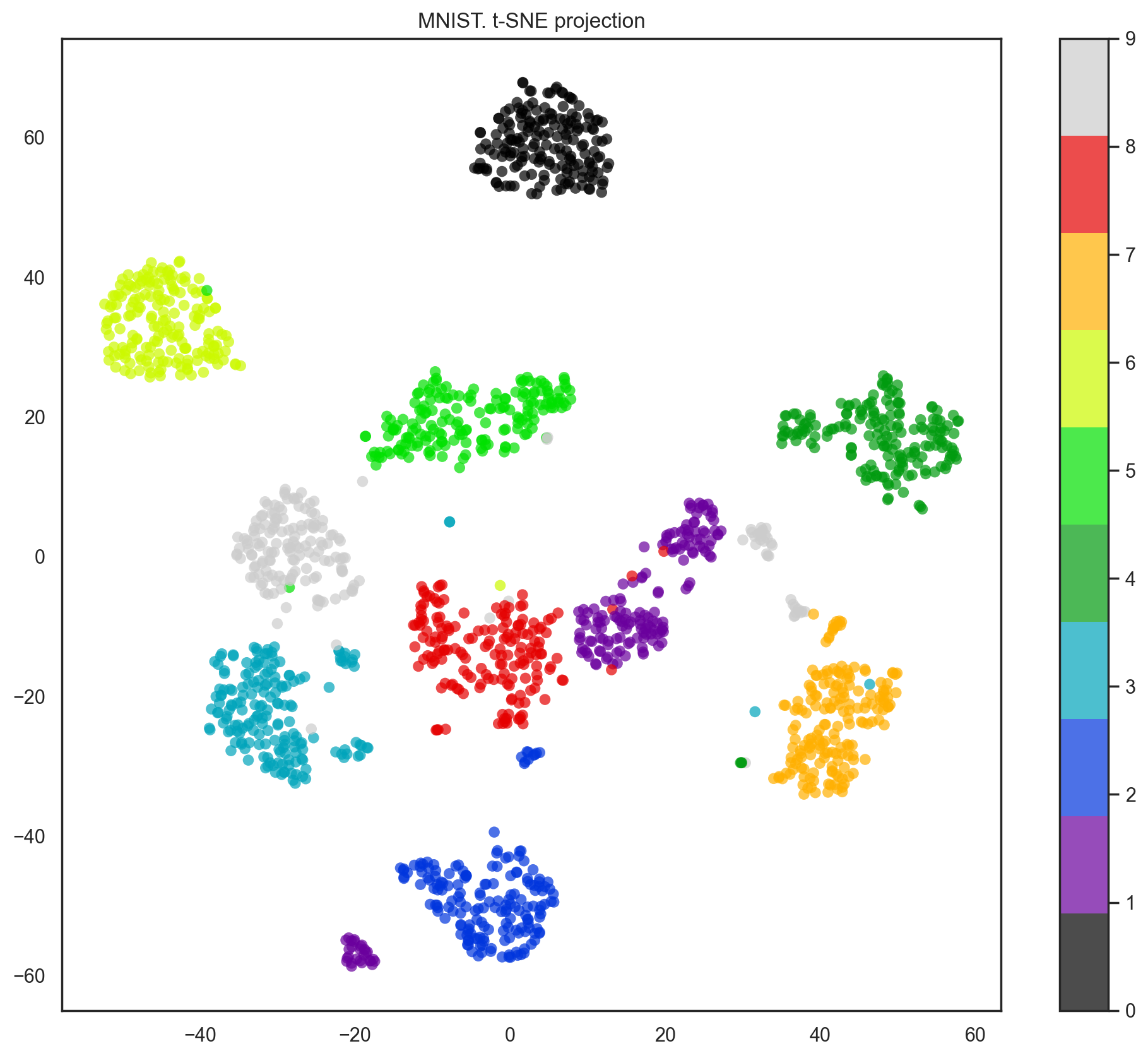
Indeed, with t-SNE, the picture looks better since PCA has a linear constraint while t-SNE does not. However, even with such a small dataset, the t-SNE algorithm takes significantly more time to complete than PCA.
%%time

from sklearn.manifold import TSNE
tsne = TSNE(random_state=17)

X_tsne = tsne.fit_transform(X)

plt.figure(figsize=(12,10))
plt.scatter(X_tsne[:, 0], X_tsne[:, 1], c=y,
            edgecolor='none', alpha=0.7, s=40,
            cmap=plt.cm.get_cmap('nipy_spectral', 10))
plt.colorbar()
plt.title('MNIST. t-SNE projection');
c:\Users\16111\AppData\Local\Programs\Python\Python38\lib\site-packages\sklearn\manifold\_t_sne.py:795: FutureWarning: The default initialization in TSNE will change from 'random' to 'pca' in 1.2.
  warnings.warn(
c:\Users\16111\AppData\Local\Programs\Python\Python38\lib\site-packages\sklearn\manifold\_t_sne.py:805: FutureWarning: The default learning rate in TSNE will change from 200.0 to 'auto' in 1.2.
  warnings.warn(
CPU times: total: 1min 2s
Wall time: 10.6 s
Text(0.5, 1.0, 'MNIST. t-SNE projection')
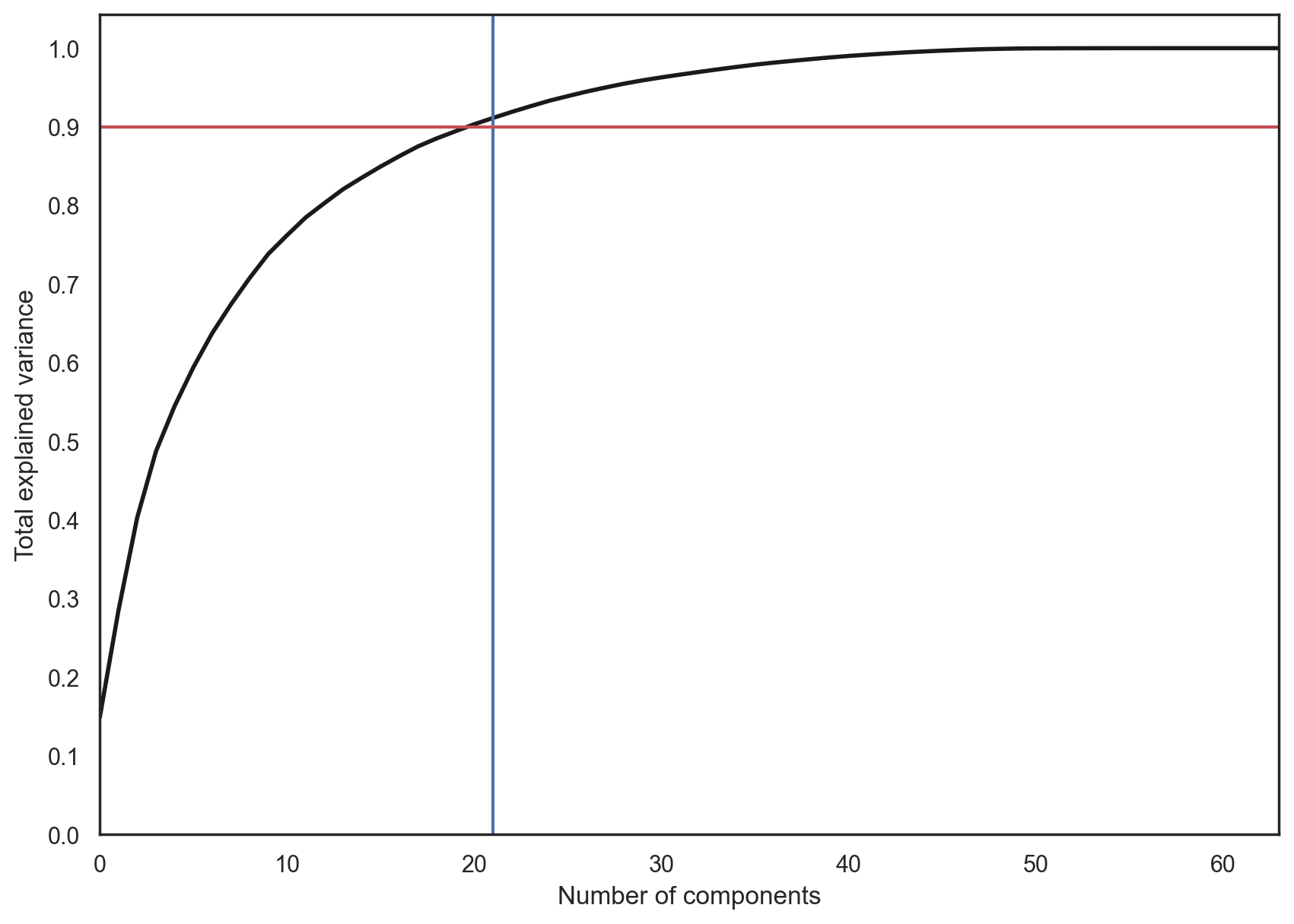
In practice, we would choose the number of principal components such that we can explain 90% of the initial data dispersion (via the explained_variance_ratio). Here, that means retaining 21 principal components; therefore, we reduce the dimensionality from 64 features to 21.
pca = decomposition.PCA().fit(X)

plt.figure(figsize=(10,7))
plt.plot(np.cumsum(pca.explained_variance_ratio_), color='k', lw=2)
plt.xlabel('Number of components')
plt.ylabel('Total explained variance')
plt.xlim(0, 63)
plt.yticks(np.arange(0, 1.1, 0.1))
plt.axvline(21, c='b')
plt.axhline(0.9, c='r')
plt.show();
43.17.8. Clustering#
Basically, “I have these points here, and I can see that they organize into groups. It would be nice to describe these things more concretely, and, when a new point comes in, assign it to the correct group.”
43.17.9. K-means#
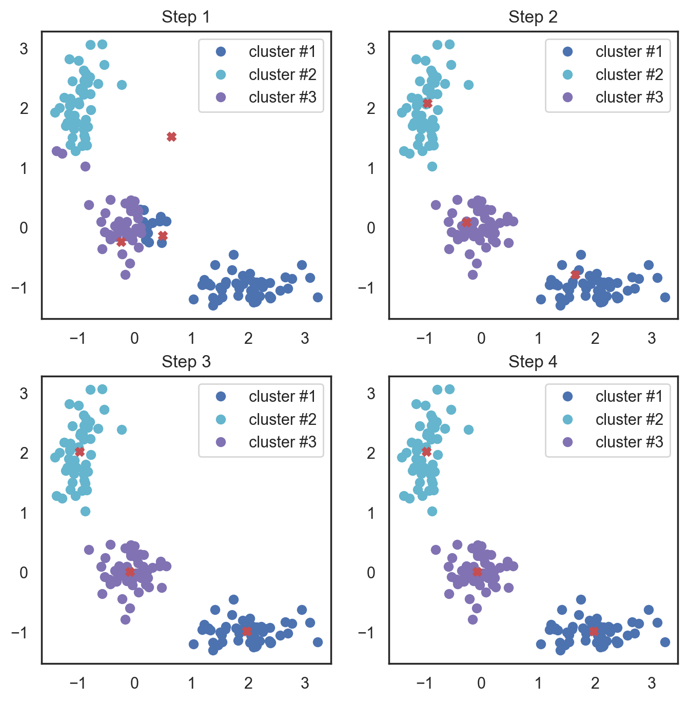
K-means algorithm is the most popular and yet simplest of all the clustering algorithms. Here is how it works:
Select the number of clusters \(k\) that you think is the optimal number.
Initialize \(k\) points as “centroids” randomly within the space of our data.
Attribute each observation to its closest centroid.
Update the centroids to the center of all the attributed set of observations.
Repeat steps 3 and 4 a fixed number of times or until all of the centroids are stable (i.e. no longer change in step 4).
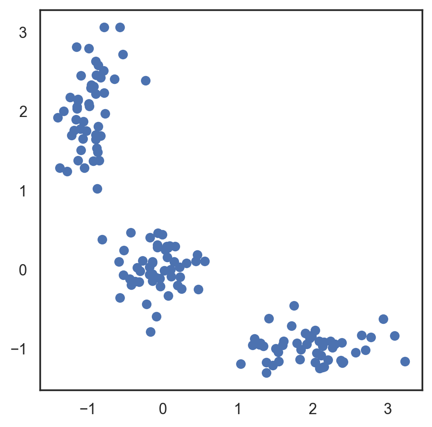
This algorithm is easy to describe and visualize. Let’s take a look.
# Let's begin by allocation 3 cluster's points
X = np.zeros((150, 2))

np.random.seed(seed=42)
X[:50, 0] = np.random.normal(loc=0.0, scale=.3, size=50)
X[:50, 1] = np.random.normal(loc=0.0, scale=.3, size=50)

X[50:100, 0] = np.random.normal(loc=2.0, scale=.5, size=50)
X[50:100, 1] = np.random.normal(loc=-1.0, scale=.2, size=50)

X[100:150, 0] = np.random.normal(loc=-1.0, scale=.2, size=50)
X[100:150, 1] = np.random.normal(loc=2.0, scale=.5, size=50)

plt.figure(figsize=(5, 5))
plt.plot(X[:, 0], X[:, 1], 'bo');
# Scipy has function that takes 2 tuples and return
# calculated distance between them
from scipy.spatial.distance import cdist

# Randomly allocate the 3 centroids
np.random.seed(seed=42)
centroids = np.random.normal(loc=0.0, scale=1., size=6)
centroids = centroids.reshape((3, 2))

cent_history = []
cent_history.append(centroids)

for i in range(3):
    # Calculating the distance from a point to a centroid
    distances = cdist(X, centroids)
    # Checking what's the closest centroid for the point
    labels = distances.argmin(axis=1)

    # Labeling the point according the point's distance
    centroids = centroids.copy()
    centroids[0, :] = np.mean(X[labels == 0, :], axis=0)
    centroids[1, :] = np.mean(X[labels == 1, :], axis=0)
    centroids[2, :] = np.mean(X[labels == 2, :], axis=0)

    cent_history.append(centroids)
# Let's plot K-means
plt.figure(figsize=(8, 8))
for i in range(4):
    distances = cdist(X, cent_history[i])
    labels = distances.argmin(axis=1)

    plt.subplot(2, 2, i + 1)
    plt.plot(X[labels == 0, 0], X[labels == 0, 1], 'bo', label='cluster #1')
    plt.plot(X[labels == 1, 0], X[labels == 1, 1], 'co', label='cluster #2')
    plt.plot(X[labels == 2, 0], X[labels == 2, 1], 'mo', label='cluster #3')
    plt.plot(cent_history[i][:, 0], cent_history[i][:, 1], 'rX')
    plt.legend(loc=0)
    plt.title('Step {:}'.format(i + 1));
Here, we used Euclidean distance, but the algorithm will converge with any other metric. You can not only vary the number of steps or the convergence criteria but also the distance measure between the points and cluster centroids.
Another “feature” of this algorithm is its sensitivity to the initial positions of the cluster centroids. You can run the algorithm several times and then average all the centroid results.
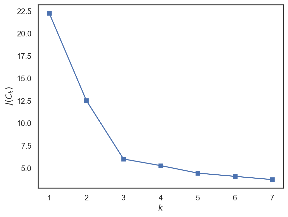
43.17.10. K-means with sklearn#
from sklearn.cluster import KMeans

inertia = []
for k in range(1, 8):
    kmeans = KMeans(n_clusters=k, random_state=1).fit(X)
    inertia.append(np.sqrt(kmeans.inertia_))

plt.plot(range(1, 8), inertia, marker='s');
plt.xlabel('$k$')
plt.ylabel('$J(C_k)$');
43.17.11. Acknowledgments#
Thanks to YURY KASHNITSKY for creating the open-source Kaggle jupyter notebook, licensed under Apache 2.0. It inspires the majority of the content of this slides.