Visualizing distributions
Contents
# Install the necessary dependencies

import os
import sys
!{sys.executable} -m pip install --quiet pandas scikit-learn numpy matplotlib jupyterlab_myst ipython birds
WARNING: Ignoring invalid distribution -rotobuf (d:\conda\envs\py39\lib\site-packages)
WARNING: Ignoring invalid distribution -rotobuf (d:\conda\envs\py39\lib\site-packages)

[notice] A new release of pip is available: 23.2.1 -> 23.3.1
[notice] To update, run: python.exe -m pip install --upgrade pip
6.1. Visualizing distributions#
In the previous section, you learned some interesting facts about a dataset about the birds of Minnesota. You found some erroneous data by visualizing outliers and looked at the differences between bird categories by their maximum length.
6.1.1. Explore the birds dataset#
Another way to dig into data is by looking at its distribution, or how the data is organized along an axis. Perhaps, for example, you’d like to learn about the general distribution, for this dataset, of the maximum wingspan or maximum body mass for the birds of Minnesota.
Let’s discover some facts about the distributions of data in this dataset.
import pandas as pd
import matplotlib.pyplot as plt
birds = pd.read_csv('https://static-1300131294.cos.ap-shanghai.myqcloud.com/data/birds.csv')
birds.head()
| Name | ScientificName | Category | Order | Family | Genus | ConservationStatus | MinLength | MaxLength | MinBodyMass | MaxBodyMass | MinWingspan | MaxWingspan | |
|---|---|---|---|---|---|---|---|---|---|---|---|---|---|
| 0 | Black-bellied whistling-duck | Dendrocygna autumnalis | Ducks/Geese/Waterfowl | Anseriformes | Anatidae | Dendrocygna | LC | 47.0 | 56.0 | 652.0 | 1020.0 | 76.0 | 94.0 |
| 1 | Fulvous whistling-duck | Dendrocygna bicolor | Ducks/Geese/Waterfowl | Anseriformes | Anatidae | Dendrocygna | LC | 45.0 | 53.0 | 712.0 | 1050.0 | 85.0 | 93.0 |
| 2 | Snow goose | Anser caerulescens | Ducks/Geese/Waterfowl | Anseriformes | Anatidae | Anser | LC | 64.0 | 79.0 | 2050.0 | 4050.0 | 135.0 | 165.0 |
| 3 | Ross's goose | Anser rossii | Ducks/Geese/Waterfowl | Anseriformes | Anatidae | Anser | LC | 57.3 | 64.0 | 1066.0 | 1567.0 | 113.0 | 116.0 |
| 4 | Greater white-fronted goose | Anser albifrons | Ducks/Geese/Waterfowl | Anseriformes | Anatidae | Anser | LC | 64.0 | 81.0 | 1930.0 | 3310.0 | 130.0 | 165.0 |
In general, you can quickly look at the way data is distributed by using a scatter plot as we did in the previous section:
birds.plot(kind='scatter', x='MaxLength', y='Order', figsize=(12, 8))

plt.title('Max Length per Order')
plt.ylabel('Order')
plt.xlabel('Max Length')

plt.show()
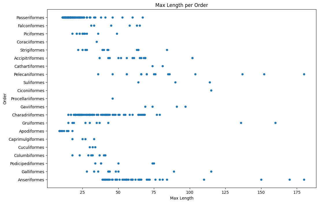
This gives an overview of the general distribution of body length per bird Order, but it is not the optimal way to display true distributions. That task is usually handled by creating a Histogram.
6.1.2. Working with histograms#
Matplotlib offers very good ways to visualize data distribution using Histograms. This type of chart is like a bar chart where the distribution can be seen via a rise and fall of the bars. To build a histogram, you need numeric data. To build a Histogram, you can plot a chart defining the kind as ‘hist’ for Histogram. This chart shows the distribution of MaxBodyMass for the entire dataset’s range of numeric data. By dividing the array of data it is given into smaller bins, it can display the distribution of the data’s values:
birds['MaxBodyMass'].plot(kind='hist', bins=10, figsize=(12, 12))
plt.show()
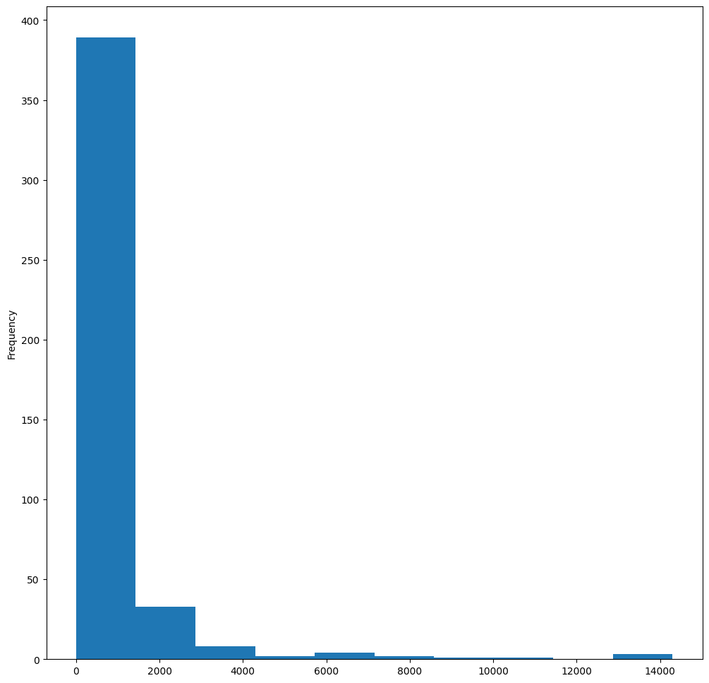
As you can see, most of the 400+ birds in this dataset fall in the range of under 2000 for their Max Body Mass. Gain more insight into the data by changing the bins parameter to a higher number, something like 30:
birds['MaxBodyMass'].plot(kind='hist', bins=30, figsize=(12, 12))
plt.show()
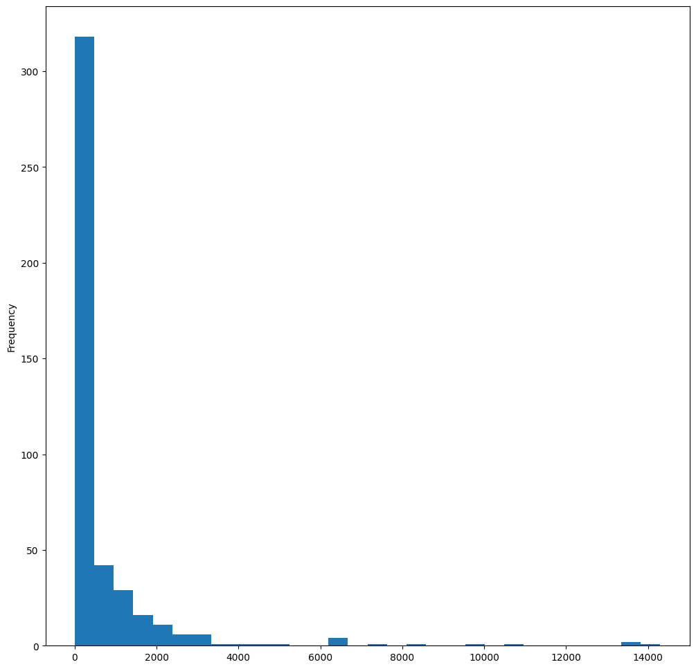
This chart shows the distribution in a bit more granular fashion. A chart less skewed to the left could be created by ensuring that you only select data within a given range:
Filter your data to get only those birds whose body mass is under 60, and show 40 bins:
filteredBirds = birds[(birds['MaxBodyMass'] > 1) & (birds['MaxBodyMass'] < 60)]
filteredBirds['MaxBodyMass'].plot(kind='hist', bins=40, figsize=(12, 12))
plt.show()
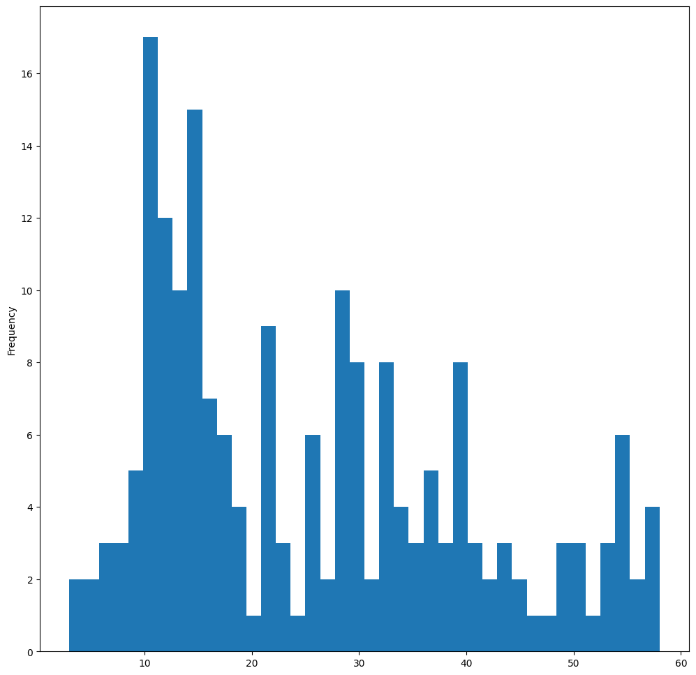
Try some other filters and data points. To see the full distribution of the data, remove the ['MaxBodyMass'] filter to show labeled distributions.
The histogram offers some nice color and labeling enhancements to try as well:
Create a 2D histogram to compare the relationship between two distributions. Let’s compare MaxBodyMass vs. MaxLength. Matplotlib offers a built-in way to show convergence using brighter colors:
x = filteredBirds['MaxBodyMass']
y = filteredBirds['MaxLength']

fig, ax = plt.subplots(tight_layout=True)
hist = ax.hist2d(x, y)
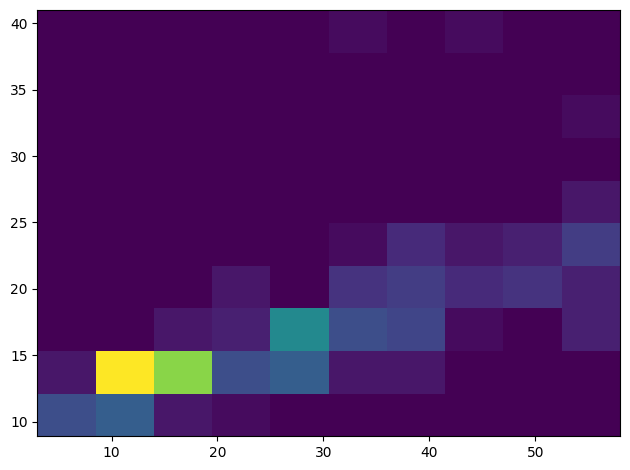
There appears to be an expected correlation between these two elements along an expected axis, with one particularly strong point of convergence:
Histograms work well by default for numeric data. What if you need to see distributions according to text data?
6.1.3. Explore the dataset for distributions using text data#
This dataset also includes good information about the bird category and its genus, species, and family as well as its conservation status. Let’s dig into this conservation information. What is the distribution of the birds according to their conservation status?
In the dataset, several acronyms are used to describe conservation status. These acronyms come from the IUCN Red List Categories, an organization that catalogs species’ status.
CR: Critically Endangered
EN: Endangered
EX: Extinct
LC: Least Concern
NT: Near Threatened
VU: Vulnerable
These are text-based values so you will need to do a transform to create a histogram. Using the filteredBirds dataframe, display its conservation status alongside its Minimum Wingspan. What do you see?
x1 = filteredBirds.loc[filteredBirds.ConservationStatus=='EX', 'MinWingspan']
x2 = filteredBirds.loc[filteredBirds.ConservationStatus=='CR', 'MinWingspan']
x3 = filteredBirds.loc[filteredBirds.ConservationStatus=='EN', 'MinWingspan']
x4 = filteredBirds.loc[filteredBirds.ConservationStatus=='NT', 'MinWingspan']
x5 = filteredBirds.loc[filteredBirds.ConservationStatus=='VU', 'MinWingspan']
x6 = filteredBirds.loc[filteredBirds.ConservationStatus=='LC', 'MinWingspan']

kwargs = dict(alpha=0.5, bins=20)

plt.hist(x1, **kwargs, color='red', label='Extinct')
plt.hist(x2, **kwargs, color='orange', label='Critically Endangered')
plt.hist(x3, **kwargs, color='yellow', label='Endangered')
plt.hist(x4, **kwargs, color='green', label='Near Threatened')
plt.hist(x5, **kwargs, color='blue', label='Vulnerable')
plt.hist(x6, **kwargs, color='gray', label='Least Concern')

plt.gca().set(title='Conservation Status', ylabel='Min Wingspan')
plt.legend();
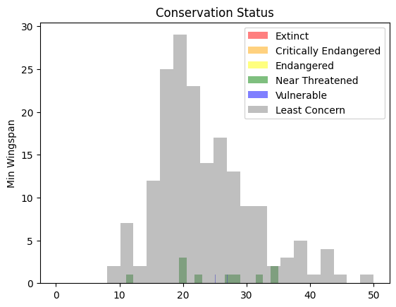
There doesn’t seem to be a good correlation between minimum wingspan and conservation status. Test other elements of the dataset using this method. You can try different filters as well. Do you find any correlation?
6.1.4. Density plots#
You may have noticed that the histograms we have looked at so far are ‘stepped’ and do not flow smoothly in an arc. To show a smoother density chart, you can try a density plot.
To work with density plots, familiarize yourself with a new plotting library, Seaborn.
Loading Seaborn, try a basic density plot:
import seaborn as sns
import matplotlib.pyplot as plt
sns.kdeplot(filteredBirds['MinWingspan'])
plt.show()
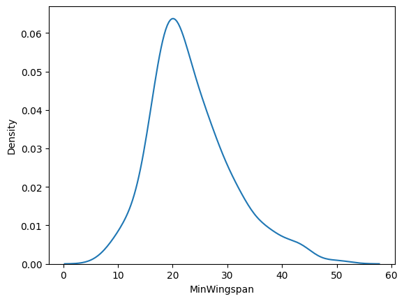
You can see how the plot echoes the previous one for Minimum Wingspan data; it’s just a bit smoother. According to Seaborn’s documentation, “Relative to a histogram, KDE can produce a plot that is less cluttered and more interpretable, especially when drawing multiple distributions. But it has the potential to introduce distortions if the underlying distribution is bounded or not smooth. Like a histogram, the quality of the representation also depends on the selection of good smoothing parameters.” source In other words, outliers as always will make your charts behave badly.
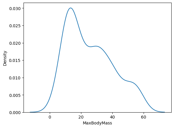
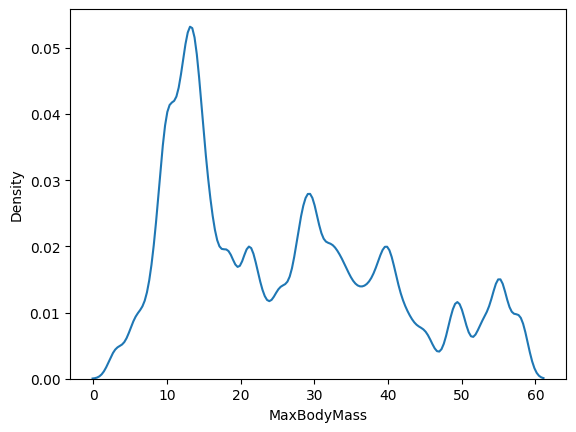
If you wanted to revisit that jagged MaxBodyMass line in the second chart you built, you could smooth it out very well by recreating it using this method:
sns.kdeplot(filteredBirds['MaxBodyMass'])
plt.show()
If you wanted a smooth, but not too smooth line, edit the bw_adjust parameter:
sns.kdeplot(filteredBirds['MaxBodyMass'], bw_adjust=.2)
plt.show()
Read about the parameters available for this type of plot and experiment!
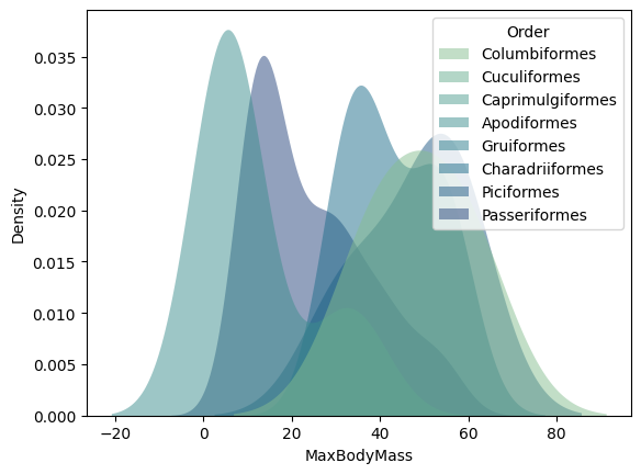
This type of chart offers beautifully explanatory visualizations. With a few lines of code, for example, you can show the max body mass density per bird Order:
sns.kdeplot(
   data=filteredBirds, x="MaxBodyMass", hue="Order",
   fill=True, common_norm=False, palette="crest",
   alpha=.5, linewidth=0,
)
C:\Users\fuqiongying\AppData\Local\Temp\ipykernel_3908\1933666654.py:1: UserWarning: Dataset has 0 variance; skipping density estimate. Pass `warn_singular=False` to disable this warning.
  sns.kdeplot(
C:\Users\fuqiongying\AppData\Local\Temp\ipykernel_3908\1933666654.py:1: UserWarning: Dataset has 0 variance; skipping density estimate. Pass `warn_singular=False` to disable this warning.
  sns.kdeplot(
<AxesSubplot: xlabel='MaxBodyMass', ylabel='Density'>
You can also map the density of several variables in one chart. Text the MaxLength and MinLength of a bird compared to their conservation status:
sns.kdeplot(data=filteredBirds, x="MinLength", y="MaxLength", hue="ConservationStatus")
C:\Users\fuqiongying\AppData\Local\Temp\ipykernel_3908\49960699.py:1: UserWarning: KDE cannot be estimated (0 variance or perfect covariance). Pass `warn_singular=False` to disable this warning.
  sns.kdeplot(data=filteredBirds, x="MinLength", y="MaxLength", hue="ConservationStatus")
<AxesSubplot: xlabel='MinLength', ylabel='MaxLength'>
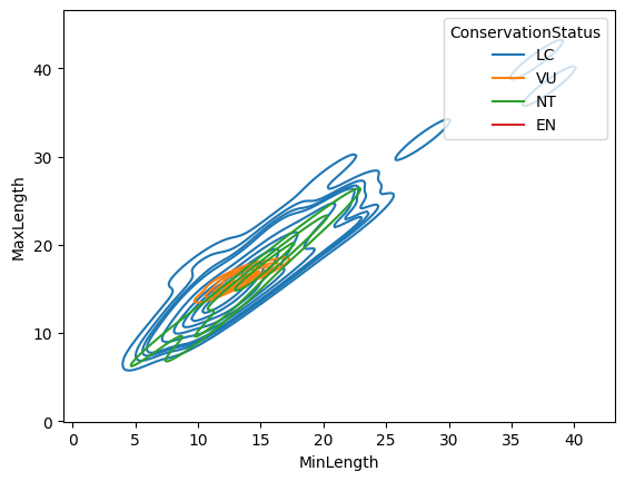
Perhaps it’s worth researching whether the cluster of ‘Vulnerable’ birds according to their lengths is meaningful or not.
6.1.5. Self study#
In this section, you used Matplotlib and started working with Seaborn to show more sophisticated charts. Do some research on kdeplot in Seaborn, a “continuous probability density curve in one or more dimensions”. Read through the documentation to understand how it works.
6.1.6. Your turn! 🚀#
Histograms are a more sophisticated type of chart than basic scatterplots, bar charts, or line charts. Go on a search on the internet to find good examples of the use of histograms. How are they used, what do they demonstrate, and in what fields or areas of inquiry do they tend to be used?
Assignment - Apply your skills
6.1.7. Acknowledgments#
Thanks to Microsoft for creating the open-source course Data Science for Beginners. It inspires the majority of the content in this chapter.