Run the notebook accompanying this lesson and look at the Month to Price scatterplot. Does the data associating Month to Price for pumpkin sales seem to have high or low correlation, according to our visual interpretation of the scatterplot? Does that change if we use more fine-grained measure instead of Month, eg. day of the year (i.e. number of days since the beginning of the year)?
11.3.1. Build a regression model using Scikit-learn: regression four ways#
So far we have explored what regression is with sample data gathered from the pumpkin pricing dataset that we will use throughout this lesson. We have also visualized it using Matplotlib.
Now we are ready to dive deeper into regression for Machine Learning. While visualization allows we to make sense of data, the real power of Machine Learning comes from training models. Models are trained on historical data to automatically capture data dependencies, and they allow we to predict outcomes for new data, which the model has not seen before.
In this lesson, we will learn more about two types of regression: basic linear regression and polynomial regression, along with some of the math underlying these techniques. Those models will allow us to predict pumpkin prices depending on different input data.
Note
Throughout this curriculum, we assume minimal knowledge of math, and seek to make it accessible for students coming from other fields, so watch for notes, callouts, diagrams, and other learning tools to aid in comprehension.
We should be familiar by now with the structure of the pumpkin data that we are examining. We can find it preloaded and pre-cleaned in this section’s linear and polynomial regression.ipynb file. In the file, the pumpkin price is displayed per bushel in a new data frame. Make sure we can run these notebooks in kernels in Visual Studio Code.
As a reminder, we are loading this data so as to ask questions about it.
When is the best time to buy pumpkins?
What price can I expect of a case of miniature pumpkins?
Should I buy them in half-bushel baskets or by the 1 1/9 bushel box?
Let’s keep digging into this data.
In the previous lesson, we created a Pandas data frame and populated it with part of the original dataset, standardizing the pricing by bushel. By doing that, however, we were only able to gather about 400 data points and only for the fall months.
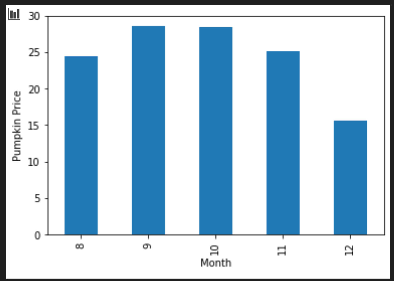
Take a look at the data that we preloaded in this lesson’s accompanying notebook. The data is preloaded and an initial scatterplot is charted to show monthly data. Maybe we can get a little more detail about the nature of the data by cleaning it more.
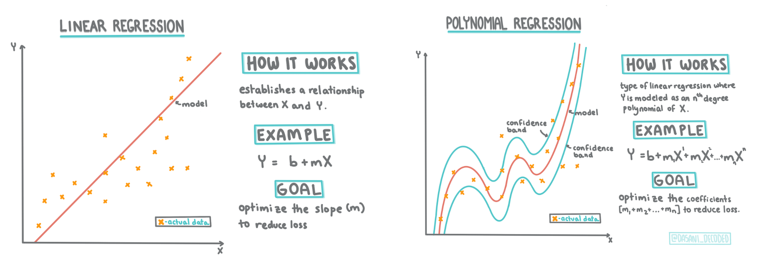
As we learned in section 1, the goal of a linear regression exercise is to be able to plot a line to:
Show variable relationships. Show the relationship between variables
Make predictions. Make accurate predictions on where a new data point would fall in relationship to that line.
It is typical of Least-Squares Regression to draw this type of line. The term ‘least-squares’ means that all the data points surrounding the regression line are squared and then added up. Ideally, that final sum is as small as possible, because we want a low number of errors or `least-squares``.
We do so since we want to model a line that has the least cumulative distance from all of our data points. We also square the terms before adding them since we are concerned with their magnitude rather than their direction.
See also
Show me the math
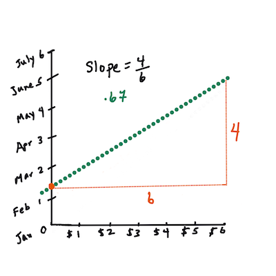
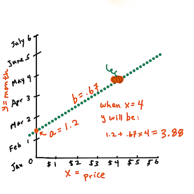
This line, called the line of best fit can be expressed by an equation:
Y=a+bX
X is the ‘explanatory variable’. Y is the ‘dependent variable’. The slope of the line is b and a is the y-intercept, which refers to the value of Y when X=0.
In other words, and referring to our pumpkin data’s original question: “predict the price of a pumpkin per bushel by month”, X would refer to the price and Y would refer to the month of sale.
Calculate the value of Y. If we’re paying around $4, it must be April!
The math that calculates the line must demonstrate the slope of the line, which is also dependent on the intercept, or where Y is situated when X=0.
We can observe the method of calculation for these values on the Math is Fun website. Also, visit this Least-squares calculator to watch how the numbers’ values impact the line.
One more term to understand is the Correlation Coefficient between given X and Y variables. Using a scatterplot, we can quickly visualize this coefficient. A plot with data points scattered in a neat line has a high correlation, but a plot with data points scattered everywhere between X and Y has a low correlation.
A good linear regression model will be one that has a high (nearer to 1 than 0) Correlation Coefficient using the Least-Squares Regression method with a line of regression.
See also
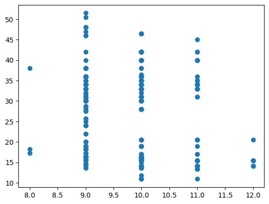
Run the notebook accompanying this lesson and look at the Month to Price scatterplot. Does the data associating Month to Price for pumpkin sales seem to have a high or low correlation, according to wer visual interpretation of the scatterplot? Does that change if we use a more fine-grained measure instead of Month, eg. day of the year (i.e. number of days since the beginning of the year)?
In the code below, we will assume that we have cleaned up the data, and obtained a data frame called new_pumpkins, similar to the following:
A basic scatterplot reminds us that we only have monthly data from August through December. We probably need more data to be able to draw conclusions in a linear fashion.
plt.scatter("Month","Price",data=new_pumpkins)
<matplotlib.collections.PathCollection at 0x7f5e7ad9e250>
Note
We have performed the same cleaning steps as in the previous section, and have calculated DayOfYear column using the following expression:
Now that we have an understanding of the math behind linear regression, let’s create a Regression model to see if we can predict which package of pumpkins will have the best pumpkin prices. Someone buying pumpkins for a holiday pumpkin patch might want this information to be able to optimize their purchases of pumpkin packages for the patch.
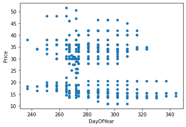
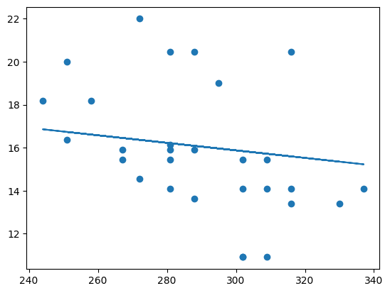
This suggests that there should be some correlation, and we can try training a linear regression model to predict the relationship between Month and Price, or between DayOfYear and Price. Here is the scatter plot that shows the latter relationship:
Fig. 11.9 Scatter plot of Price vs. Day of Year[Loob]#
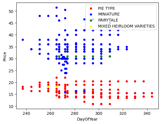
It looks like there are different clusters of prices corresponding to different pumpkin varieties. To confirm this hypothesis, let’s plot each pumpkin category using a different color. By passing an ax parameter to the scatter plotting function we can plot all points on the same graph:
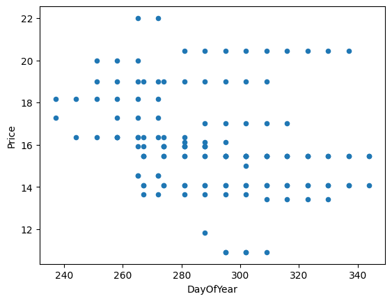
Our investigation suggests that variety has more effect on the overall price than the actual selling date. So let us focus for the moment only on one pumpkin variety, and see what effect the date has on the price:
If we now calculate the correlation between Price and DayOfYear using corr function, we will get something like -0.27 - which means that training a predictive model makes sense.
Note
Before training a linear regression model, it is important to make sure that our data is clean. Linear regression does not work well with missing values, thus it makes sense to get rid of all empty cells:
Note that we had to perform reshape on the input data in order for the Linear Regression package to understand it correctly. Linear Regression expects a 2D-array as an input, where each row of the array corresponds to a vector of input features. In our case, since we have only one input - we need an array with shape N×1, where N is the dataset size.
Then, we need to split the data into train and test datasets, so that we can validate our model after training:
Finally, training the actual Linear Regression model takes only two lines of code. We define the LinearRegression object, and fit it to our data using the fit method:
In a Jupyter environment, please rerun this cell to show the HTML representation or trust the notebook. On GitHub, the HTML representation is unable to render, please try loading this page with nbviewer.org.
LinearRegression()
The LinearRegression object after fit-ting contains all the coefficients of the regression, which can be accessed using .coef_ property. In our case, there is just one coefficient, which should be around -0.017. It means that prices seem to drop a bit with time, but not too much, around 2 cents per day. We can also access the intersection point of the regression with the Y-axis using lin_reg.intercept_-itwillbearound21` in our case, indicating the price at the beginning of the year.
To see how accurate our model is, we can predict prices on a test dataset, and then measure how close our predictions are to the expected values. This can be done using mean square error (MSE) metrics, which is the mean of all squared differences between expected and predicted values.
Our error seems to be around 2 points, which is ~17%. Not too good. Another indicator of model quality is the coefficient of determination, which can be obtained like this:
If the value is 0, it means that the model does not take input data into account, and acts as the worst linear predictor, which is simply a mean value of the result. The value of 1 means that we can perfectly predict all expected outputs. In our case, the coefficient is around 0.06, which is quite low.
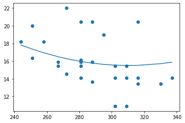
We can also plot the test data together with the regression line to better see how regression works in our case:
Another type of Linear Regression is Polynomial Regression. While sometimes there’s a linear relationship between variables - the bigger the pumpkin in volume, the higher the price - sometimes these relationships can’t be plotted as a plane or straight line.
See also
Here are some more examples of data that could use Polynomial Regression
Take another look at the relationship between Date and Price. Does this scatterplot seem like it should necessarily be analyzed by a straight line? Can’t prices fluctuate? In this case, we can try polynomial regression.
Note
Polynomials are mathematical expressions that might consist of one or more variables and coefficients.
Polynomial regression creates a curved line to better fit nonlinear data. In our case, if we include a squared DayOfYear variable in input data, we should be able to fit our data with a parabolic curve, which will have a minimum at a certain point within the year.
Scikit-learn includes a helpful pipeline API to combine different steps of data processing together. A pipeline is a chain of estimators. In our case, we will create a pipeline that first adds polynomial features to our model, and then trains the regression:
In a Jupyter environment, please rerun this cell to show the HTML representation or trust the notebook. On GitHub, the HTML representation is unable to render, please try loading this page with nbviewer.org.
Using PolynomialFeatures(2) means that we will include all second-degree polynomials from the input data. In our case, it will just mean \(DayOfYear^2\), but given two input variables X and Y, this will add \(X^2\), XY and \(Y^2\). We may also use higher-degree polynomials if we want.
Pipelines can be used in the same manner as the original LinearRegression object, i.e. we can fit the pipeline, and then use predict to get the prediction results. Here is the graph showing test data, and the approximation curve:
Using Polynomial Regression, we can get slightly lower MSE and higher determination, but not significantly. We need to take into account other features!
See also
We can see that the minimal pumpkin prices are observed somewhere around Halloween. How can we explain this?
🎃 Congratulations, we just created a model that can help predict the price of pie pumpkins. We can probably repeat the same procedure for all pumpkin types, but that would be tedious. Let’s learn now how to take pumpkin variety into account in our model!
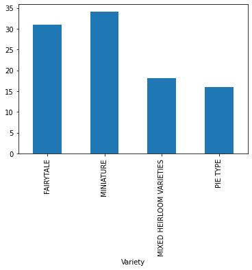
In the ideal world, we want to be able to predict prices for different pumpkin varieties using the same model. However, the Variety column is somewhat different from columns like Month, because it contains non-numeric values. Such columns are called categorical.
Here we can see how the average price depends on variety:
To take variety into account, we first need to convert it to numeric form or encode** it. There are several ways we can do it:
Simple numeric encoding will build a table of different varieties, and then replace the variety name by an index in that table. This is not the best idea for linear regression, because linear regression takes the actual numeric value of the index, and adds it to the result, multiplying by some coefficient. In our case, the relationship between the index number and the price is clearly non-linear, even if we make sure that indices are ordered in some specific way.
One-hot encoding will replace the Variety column by 4 different columns, one for each variety. Each column will contain 1 if the corresponding row is of a given variety and `0`` otherwise. This means that there will be four coefficients in linear regression, one for each pumpkin variety, responsible for the “starting price” (or rather “additional price”) for that particular variety.
The code below shows how we can one-hot encode a variety:
pd.get_dummies(new_pumpkins["Variety"])
FAIRYTALE
MINIATURE
MIXED HEIRLOOM VARIETIES
PIE TYPE
70
0
0
0
1
71
0
0
0
1
72
0
0
0
1
73
0
0
0
1
74
0
0
0
1
...
...
...
...
...
1738
0
1
0
0
1739
0
1
0
0
1740
0
1
0
0
1741
0
1
0
0
1742
0
1
0
0
415 rows × 4 columns
To train linear regression using one-hot encoded variety as input, we just need to initialize X and y data correctly:
The rest of the code is the same as what we used above to train Linear Regression. If we try it, we will see that the mean squared error is about the same, but we get the much higher coefficient of determination (~77%). To get even more accurate predictions, we can take more categorical features into account, as well as numeric features, such as Month or DayOfYear. To get one large array of features, we can use join:
To make the best model, we can use combined (one-hot encoded categorical + numeric) data from the above example together with Polynomial Regression. Here is the complete code for our convenience:
# set up training dataX=(pd.get_dummies(new_pumpkins["Variety"]).join(new_pumpkins["Month"]).join(pd.get_dummies(new_pumpkins["City"])).join(pd.get_dummies(new_pumpkins["Package"])))y=new_pumpkins["Price"]# make train-test splitX_train,X_test,y_train,y_test=train_test_split(X,y,test_size=0.2,random_state=0)# setup and train the pipelinepipeline=make_pipeline(PolynomialFeatures(2),LinearRegression())pipeline.fit(X_train,y_train)# predict results for test datapred=pipeline.predict(X_test)# calculate MSE and determinationmse=np.sqrt(mean_squared_error(y_test,pred))print(f"Mean error: {mse:3.3} ({mse/np.mean(pred)*100:3.3}%)")score=pipeline.score(X_train,y_train)print("Model determination: ",score)
Mean error: 2.23 (8.28%)
Model determination:  0.9652659492293556
This should give us the best determination coefficient of almost 97%, and MSE=2.23 (~8% prediction error).
Model
MSE
Determination
DayOfYear Linear
2.77 (17.2%)
0.07
DayOfYear Polynomial
2.73 (17.0%)
0.08
Variety Linear
5.24 (19.7%)
0.77
All features Linear
2.84 (10.5%)
0.94
All features Polynomial
2.23 (8.25%)
0.97
🏆 Well done! We created four Regression models in one section and improved the model quality to 97%. In the final section on Regression, we will learn about Logistic Regression to determine categories.
In this section, we learned about Linear Regression. There are other important types of Regression. Read about Stepwise, Ridge, Lasso and Elasticnet techniques. A good course to study to learn more is the Stanford Statistical Learning course