Data visualization
Contents
%%html
<!-- The customized css for the slides -->
<link rel="stylesheet" type="text/css" href="../../assets/styles/basic.css"/>
<link rel="stylesheet" type="text/css" href="../../assets/styles/python-programming-basic.css"/>
# Install the necessary dependencies

import os
import sys
!{sys.executable} -m pip install --quiet pandas scikit-learn numpy matplotlib jupyterlab_myst ipython seaborn pywaffle
43.7. Data visualization#
43.7.1. 1. What’s data visualization#
Visualizing data is one of the most important tasks of a data scientist. Images are worth 1000 words, and a visualization can help you identify all kinds of interesting parts of your data such as,
spikes,
outliers,
groupings,
tendencies,
etc.
43.7.2. 2. Visualizing quantities#
An excellent library to create both simple and sophisticated plots and charts of various kinds is Matplotlib.

Use the best chart to suit your data’s structure and the story you want to tell.
To analyze trends over time: line
To compare values: bar, column, pie, scatterplot
To show how parts relate to a whole: pie
To show distribution of data: scatterplot, bar
To show trends: line, column
To show relationships between values: line, scatterplot, bubble
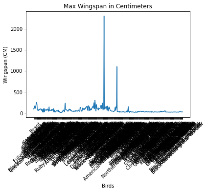
43.7.2.1. Build a line plot about bird wingspan values#
import pandas as pd
import matplotlib.pyplot as plt
birds = pd.read_csv('https://static-1300131294.cos.accelerate.myqcloud.com/data/birds.csv')
birds.head()
| Name | ScientificName | Category | Order | Family | Genus | ConservationStatus | MinLength | MaxLength | MinBodyMass | MaxBodyMass | MinWingspan | MaxWingspan | |
|---|---|---|---|---|---|---|---|---|---|---|---|---|---|
| 0 | Black-bellied whistling-duck | Dendrocygna autumnalis | Ducks/Geese/Waterfowl | Anseriformes | Anatidae | Dendrocygna | LC | 47.0 | 56.0 | 652.0 | 1020.0 | 76.0 | 94.0 |
| 1 | Fulvous whistling-duck | Dendrocygna bicolor | Ducks/Geese/Waterfowl | Anseriformes | Anatidae | Dendrocygna | LC | 45.0 | 53.0 | 712.0 | 1050.0 | 85.0 | 93.0 |
| 2 | Snow goose | Anser caerulescens | Ducks/Geese/Waterfowl | Anseriformes | Anatidae | Anser | LC | 64.0 | 79.0 | 2050.0 | 4050.0 | 135.0 | 165.0 |
| 3 | Ross's goose | Anser rossii | Ducks/Geese/Waterfowl | Anseriformes | Anatidae | Anser | LC | 57.3 | 64.0 | 1066.0 | 1567.0 | 113.0 | 116.0 |
| 4 | Greater white-fronted goose | Anser albifrons | Ducks/Geese/Waterfowl | Anseriformes | Anatidae | Anser | LC | 64.0 | 81.0 | 1930.0 | 3310.0 | 130.0 | 165.0 |
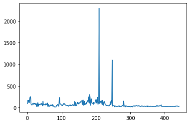
wingspan = birds['MaxWingspan']
wingspan.plot()
<AxesSubplot: >
plt.title('Max Wingspan in Centimeters')
plt.ylabel('Wingspan (CM)')
plt.xlabel('Birds')
plt.xticks(rotation=45)
x = birds['Name']
y = birds['MaxWingspan']

plt.plot(x, y)

plt.show()
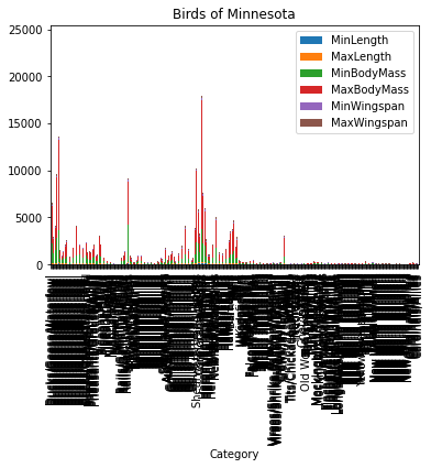
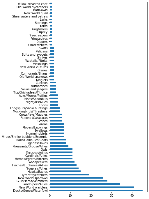
43.7.2.2. Explore bar charts#
birds.plot(
    x='Category',
    kind='bar',
    stacked=True,
    title='Birds of Minnesota'
)
<AxesSubplot: title={'center': 'Birds of Minnesota'}, xlabel='Category'>
category_count = birds.value_counts(birds['Category'].values, sort=True)
plt.rcParams['figure.figsize'] = [6, 12]
category_count.plot.barh()
<AxesSubplot: >
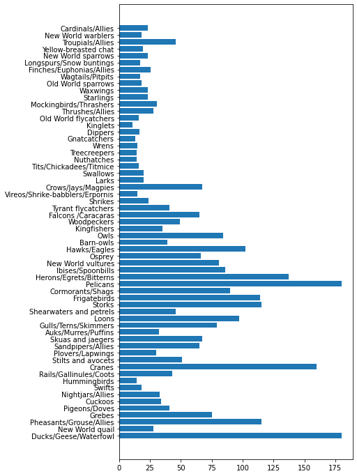
43.7.2.3. Comparing data#
maxlength = birds['MaxLength']
plt.barh(y=birds['Category'], width=maxlength)
plt.rcParams['figure.figsize'] = [6, 12]
plt.show()
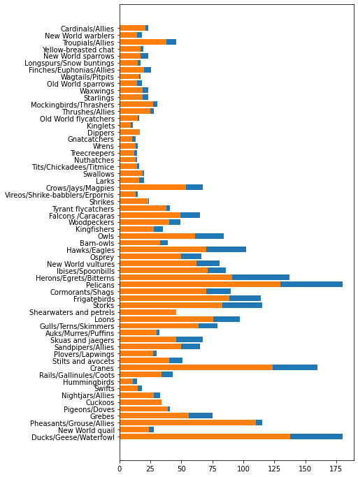
minLength = birds['MinLength']
maxLength = birds['MaxLength']
category = birds['Category']

plt.barh(category, maxLength)
plt.barh(category, minLength)

plt.show()
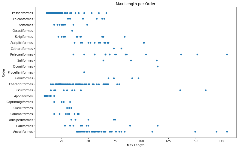
43.7.3. 3. Visualizing distributions#
Another way to dig into data is by looking at its distribution, or how the data is organized along an axis.
43.7.3.1. Explore the birds dataset#
birds.plot(kind='scatter', x='MaxLength', y='Order', figsize=(12, 8))

plt.title('Max Length per Order')
plt.ylabel('Order')
plt.xlabel('Max Length')

plt.show()
43.7.3.2. Working with histograms#
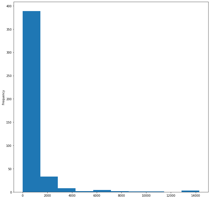
birds['MaxBodyMass'].plot(kind='hist', bins=10, figsize=(12, 12))
plt.show()
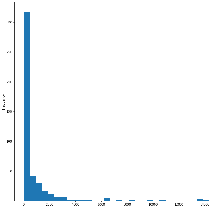
birds['MaxBodyMass'].plot(kind='hist', bins=30, figsize=(12, 12))
plt.show()
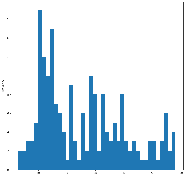
filteredBirds = birds[(birds['MaxBodyMass'] > 1) & (birds['MaxBodyMass'] < 60)]
filteredBirds['MaxBodyMass'].plot(kind='hist', bins=40, figsize=(12, 12))
plt.show()
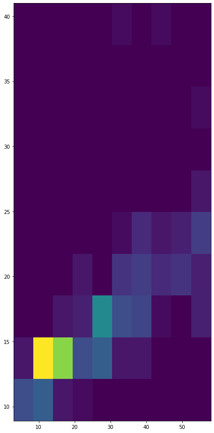
x = filteredBirds['MaxBodyMass']
y = filteredBirds['MaxLength']

fig, ax = plt.subplots(tight_layout=True)
hist = ax.hist2d(x, y)
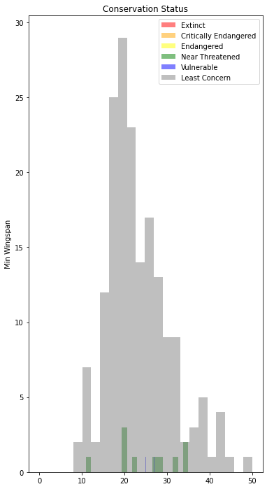
43.7.3.3. Explore the dataset for distributions using text data#
x1 = filteredBirds.loc[filteredBirds.ConservationStatus == 'EX', 'MinWingspan']
x2 = filteredBirds.loc[filteredBirds.ConservationStatus == 'CR', 'MinWingspan']
x3 = filteredBirds.loc[filteredBirds.ConservationStatus == 'EN', 'MinWingspan']
x4 = filteredBirds.loc[filteredBirds.ConservationStatus == 'NT', 'MinWingspan']
x5 = filteredBirds.loc[filteredBirds.ConservationStatus == 'VU', 'MinWingspan']
x6 = filteredBirds.loc[filteredBirds.ConservationStatus == 'LC', 'MinWingspan']

kwargs = dict(alpha=0.5, bins=20)

plt.hist(x1, **kwargs, color='red', label='Extinct')
plt.hist(x2, **kwargs, color='orange', label='Critically Endangered')
plt.hist(x3, **kwargs, color='yellow', label='Endangered')
plt.hist(x4, **kwargs, color='green', label='Near Threatened')
plt.hist(x5, **kwargs, color='blue', label='Vulnerable')
plt.hist(x6, **kwargs, color='gray', label='Least Concern')

plt.gca().set(title='Conservation Status', ylabel='Min Wingspan')
plt.legend()
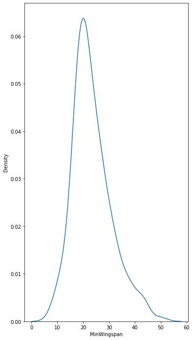
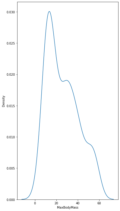
43.7.3.4. Density plots#
import seaborn as sns
sns.kdeplot(filteredBirds['MinWingspan'])
plt.show()
sns.kdeplot(filteredBirds['MaxBodyMass'])
plt.show()
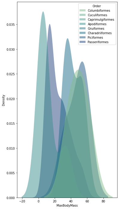
sns.kdeplot(
    data=filteredBirds, x="MaxBodyMass", hue="Order",
    fill=True, common_norm=False, palette="crest",
    alpha=.5, linewidth=0,
)
/var/folders/h0/kqxjp1r14yggzhpqx_gpx6580000gn/T/ipykernel_15370/1933666654.py:1: UserWarning: Dataset has 0 variance; skipping density estimate. Pass `warn_singular=False` to disable this warning.
  sns.kdeplot(
/var/folders/h0/kqxjp1r14yggzhpqx_gpx6580000gn/T/ipykernel_15370/1933666654.py:1: UserWarning: Dataset has 0 variance; skipping density estimate. Pass `warn_singular=False` to disable this warning.
  sns.kdeplot(
<AxesSubplot: xlabel='MaxBodyMass', ylabel='Density'>
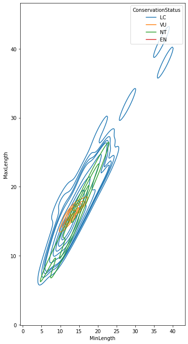
sns.kdeplot(
    data=filteredBirds, x="MinLength", y="MaxLength", hue="ConservationStatus"
)
/var/folders/h0/kqxjp1r14yggzhpqx_gpx6580000gn/T/ipykernel_15370/49960699.py:1: UserWarning: KDE cannot be estimated (0 variance or perfect covariance). Pass `warn_singular=False` to disable this warning.
  sns.kdeplot(data=filteredBirds, x="MinLength", y="MaxLength", hue="ConservationStatus")
<AxesSubplot: xlabel='MinLength', ylabel='MaxLength'>
43.7.4. 4. Visualizing proportions#
We will use a given dataset about mushrooms to experiment with tasty visualizations such as:
Pie charts 🥧
Donut charts 🍩
Waffle charts 🧇
43.7.4.1. Get to know your mushrooms 🍄#
mushrooms = pd.read_csv('../data/mushrooms.csv')
mushrooms.head()
| class | cap-shape | cap-surface | cap-color | bruises | odor | gill-attachment | gill-spacing | gill-size | gill-color | ... | stalk-surface-below-ring | stalk-color-above-ring | stalk-color-below-ring | veil-type | veil-color | ring-number | ring-type | spore-print-color | population | habitat | |
|---|---|---|---|---|---|---|---|---|---|---|---|---|---|---|---|---|---|---|---|---|---|
| 0 | Poisonous | Convex | Smooth | Brown | Bruises | Pungent | Free | Close | Narrow | Black | ... | Smooth | White | White | Partial | White | One | Pendant | Black | Scattered | Urban |
| 1 | Edible | Convex | Smooth | Yellow | Bruises | Almond | Free | Close | Broad | Black | ... | Smooth | White | White | Partial | White | One | Pendant | Brown | Numerous | Grasses |
| 2 | Edible | Bell | Smooth | White | Bruises | Anise | Free | Close | Broad | Brown | ... | Smooth | White | White | Partial | White | One | Pendant | Brown | Numerous | Meadows |
| 3 | Poisonous | Convex | Scaly | White | Bruises | Pungent | Free | Close | Narrow | Brown | ... | Smooth | White | White | Partial | White | One | Pendant | Black | Scattered | Urban |
| 4 | Edible | Convex | Smooth | Green | No Bruises | None | Free | Crowded | Broad | Black | ... | Smooth | White | White | Partial | White | One | Evanescent | Brown | Abundant | Grasses |
5 rows × 23 columns
cols = mushrooms.select_dtypes(["object"]).columns
mushrooms[cols] = mushrooms[cols].astype('category')
edibleclass = mushrooms.groupby(['class']).count()
edibleclass
| cap-shape | cap-surface | cap-color | bruises | odor | gill-attachment | gill-spacing | gill-size | gill-color | stalk-shape | ... | stalk-surface-below-ring | stalk-color-above-ring | stalk-color-below-ring | veil-type | veil-color | ring-number | ring-type | spore-print-color | population | habitat | |
|---|---|---|---|---|---|---|---|---|---|---|---|---|---|---|---|---|---|---|---|---|---|
| class | |||||||||||||||||||||
| Edible | 4208 | 4208 | 4208 | 4208 | 4208 | 4208 | 4208 | 4208 | 4208 | 4208 | ... | 4208 | 4208 | 4208 | 4208 | 4208 | 4208 | 4208 | 4208 | 4208 | 4208 |
| Poisonous | 3916 | 3916 | 3916 | 3916 | 3916 | 3916 | 3916 | 3916 | 3916 | 3916 | ... | 3916 | 3916 | 3916 | 3916 | 3916 | 3916 | 3916 | 3916 | 3916 | 3916 |
2 rows × 22 columns
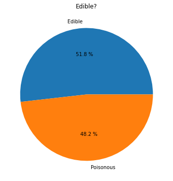
43.7.4.2. Pie!#
labels = ['Edible', 'Poisonous']
plt.pie(edibleclass['population'], labels=labels, autopct='%.1f %%')
plt.title('Edible?')
plt.show()
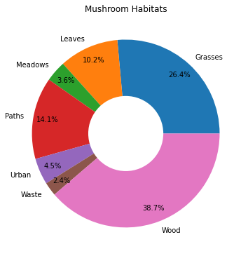
43.7.4.3. Donuts!#
habitat = mushrooms.groupby(['habitat']).count()
habitat
| class | cap-shape | cap-surface | cap-color | bruises | odor | gill-attachment | gill-spacing | gill-size | gill-color | ... | stalk-surface-above-ring | stalk-surface-below-ring | stalk-color-above-ring | stalk-color-below-ring | veil-type | veil-color | ring-number | ring-type | spore-print-color | population | |
|---|---|---|---|---|---|---|---|---|---|---|---|---|---|---|---|---|---|---|---|---|---|
| habitat | |||||||||||||||||||||
| Grasses | 2148 | 2148 | 2148 | 2148 | 2148 | 2148 | 2148 | 2148 | 2148 | 2148 | ... | 2148 | 2148 | 2148 | 2148 | 2148 | 2148 | 2148 | 2148 | 2148 | 2148 |
| Leaves | 832 | 832 | 832 | 832 | 832 | 832 | 832 | 832 | 832 | 832 | ... | 832 | 832 | 832 | 832 | 832 | 832 | 832 | 832 | 832 | 832 |
| Meadows | 292 | 292 | 292 | 292 | 292 | 292 | 292 | 292 | 292 | 292 | ... | 292 | 292 | 292 | 292 | 292 | 292 | 292 | 292 | 292 | 292 |
| Paths | 1144 | 1144 | 1144 | 1144 | 1144 | 1144 | 1144 | 1144 | 1144 | 1144 | ... | 1144 | 1144 | 1144 | 1144 | 1144 | 1144 | 1144 | 1144 | 1144 | 1144 |
| Urban | 368 | 368 | 368 | 368 | 368 | 368 | 368 | 368 | 368 | 368 | ... | 368 | 368 | 368 | 368 | 368 | 368 | 368 | 368 | 368 | 368 |
| Waste | 192 | 192 | 192 | 192 | 192 | 192 | 192 | 192 | 192 | 192 | ... | 192 | 192 | 192 | 192 | 192 | 192 | 192 | 192 | 192 | 192 |
| Wood | 3148 | 3148 | 3148 | 3148 | 3148 | 3148 | 3148 | 3148 | 3148 | 3148 | ... | 3148 | 3148 | 3148 | 3148 | 3148 | 3148 | 3148 | 3148 | 3148 | 3148 |
7 rows × 22 columns
labels = ['Grasses', 'Leaves', 'Meadows', 'Paths', 'Urban', 'Waste', 'Wood']

plt.pie(
    habitat['class'], labels=labels,
    autopct='%1.1f%%', pctdistance=0.85
)

center_circle = plt.Circle((0, 0), 0.40, fc='white')
fig = plt.gcf()

fig.gca().add_artist(center_circle)

plt.title('Mushroom Habitats')

plt.show()
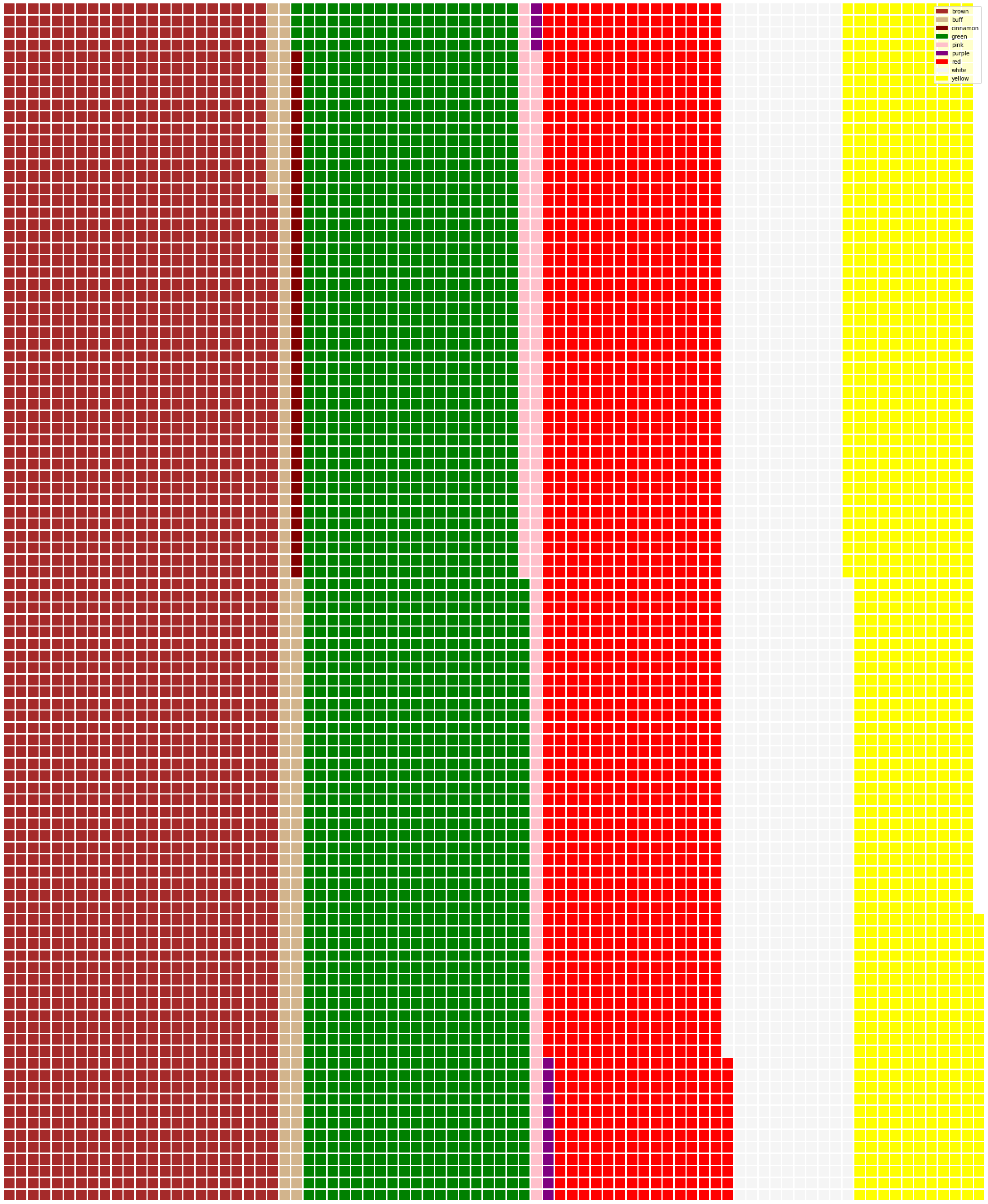
43.7.4.4. Waffles!#
capcolor = mushrooms.groupby(['cap-color']).count()
capcolor
| class | cap-shape | cap-surface | bruises | odor | gill-attachment | gill-spacing | gill-size | gill-color | stalk-shape | ... | stalk-surface-below-ring | stalk-color-above-ring | stalk-color-below-ring | veil-type | veil-color | ring-number | ring-type | spore-print-color | population | habitat | |
|---|---|---|---|---|---|---|---|---|---|---|---|---|---|---|---|---|---|---|---|---|---|
| cap-color | |||||||||||||||||||||
| Brown | 2284 | 2284 | 2284 | 2284 | 2284 | 2284 | 2284 | 2284 | 2284 | 2284 | ... | 2284 | 2284 | 2284 | 2284 | 2284 | 2284 | 2284 | 2284 | 2284 | 2284 |
| Buff | 168 | 168 | 168 | 168 | 168 | 168 | 168 | 168 | 168 | 168 | ... | 168 | 168 | 168 | 168 | 168 | 168 | 168 | 168 | 168 | 168 |
| Cinnamon | 44 | 44 | 44 | 44 | 44 | 44 | 44 | 44 | 44 | 44 | ... | 44 | 44 | 44 | 44 | 44 | 44 | 44 | 44 | 44 | 44 |
| Green | 1856 | 1856 | 1856 | 1856 | 1856 | 1856 | 1856 | 1856 | 1856 | 1856 | ... | 1856 | 1856 | 1856 | 1856 | 1856 | 1856 | 1856 | 1856 | 1856 | 1856 |
| Pink | 144 | 144 | 144 | 144 | 144 | 144 | 144 | 144 | 144 | 144 | ... | 144 | 144 | 144 | 144 | 144 | 144 | 144 | 144 | 144 | 144 |
| Purple | 16 | 16 | 16 | 16 | 16 | 16 | 16 | 16 | 16 | 16 | ... | 16 | 16 | 16 | 16 | 16 | 16 | 16 | 16 | 16 | 16 |
| Red | 1500 | 1500 | 1500 | 1500 | 1500 | 1500 | 1500 | 1500 | 1500 | 1500 | ... | 1500 | 1500 | 1500 | 1500 | 1500 | 1500 | 1500 | 1500 | 1500 | 1500 |
| White | 1040 | 1040 | 1040 | 1040 | 1040 | 1040 | 1040 | 1040 | 1040 | 1040 | ... | 1040 | 1040 | 1040 | 1040 | 1040 | 1040 | 1040 | 1040 | 1040 | 1040 |
| Yellow | 1072 | 1072 | 1072 | 1072 | 1072 | 1072 | 1072 | 1072 | 1072 | 1072 | ... | 1072 | 1072 | 1072 | 1072 | 1072 | 1072 | 1072 | 1072 | 1072 | 1072 |
9 rows × 22 columns
from pywaffle import Waffle

data = {
    'color': ['brown', 'buff', 'cinnamon', 'green', 'pink', 'purple', 'red', 'white', 'yellow'],
    'amount': capcolor['class']
}

df = pd.DataFrame(data)

fig = plt.figure(
    FigureClass=Waffle,
    rows=100,
    values=df.amount,
    labels=list(df.color),
    figsize=(30, 30),
    colors=[
        "brown", "tan", "maroon", "green", "pink",
        "purple", "red", "whitesmoke", "yellow"
    ],
)
43.7.5. 5. Visualizing relationships: all about honey#
Seaborn, which we have used before, as a good library to visualize relationships between variables.
43.7.5.1. Scatterplots#
honey = pd.read_csv('../data/honey.csv')
honey.head()
| state | numcol | yieldpercol | totalprod | stocks | priceperlb | prodvalue | year | |
|---|---|---|---|---|---|---|---|---|
| 0 | AL | 16000.0 | 71 | 1136000.0 | 159000.0 | 0.72 | 818000.0 | 1998 |
| 1 | AZ | 55000.0 | 60 | 3300000.0 | 1485000.0 | 0.64 | 2112000.0 | 1998 |
| 2 | AR | 53000.0 | 65 | 3445000.0 | 1688000.0 | 0.59 | 2033000.0 | 1998 |
| 3 | CA | 450000.0 | 83 | 37350000.0 | 12326000.0 | 0.62 | 23157000.0 | 1998 |
| 4 | CO | 27000.0 | 72 | 1944000.0 | 1594000.0 | 0.70 | 1361000.0 | 1998 |
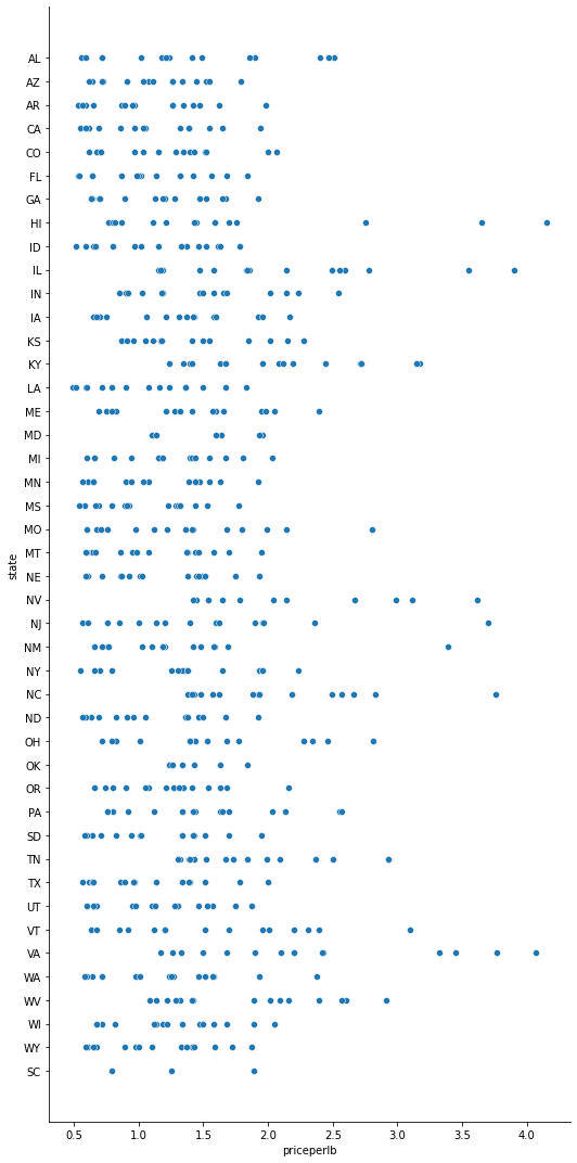
sns.relplot(x="priceperlb", y="state", data=honey, height=15, aspect=.5)
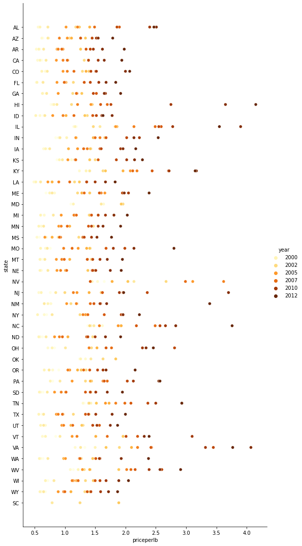
sns.relplot(
    x="priceperlb", y="state", hue="year",
    palette="YlOrBr", data=honey, height=15, aspect=.5
)
43.7.5.2. Line charts#
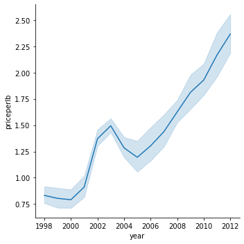
sns.relplot(x="year", y="priceperlb", kind="line", data=honey)
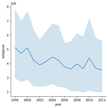
sns.relplot(x="year", y="totalprod", kind="line", data=honey);
43.7.5.3. Facet grids#
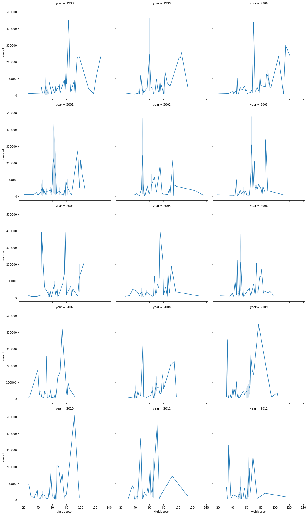
sns.relplot(
    data=honey,
    x="yieldpercol", y="numcol",
    col="year",
    col_wrap=3,
    kind="line"
)
<seaborn.axisgrid.FacetGrid at 0x132a05eb0>
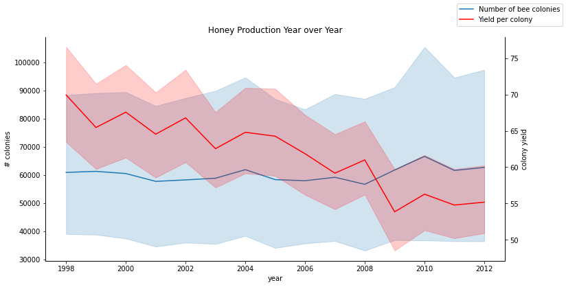
43.7.5.4. Dual-line plots#
fig, ax = plt.subplots(figsize=(12, 6))
lineplot = sns.lineplot(x=honey['year'], y=honey['numcol'], data=honey,
                        label='Number of bee colonies', legend=False)
sns.despine()
plt.ylabel('# colonies')
plt.title('Honey Production Year over Year')

ax2 = ax.twinx()
lineplot2 = sns.lineplot(
    x=honey['year'], y=honey['yieldpercol'], ax=ax2, color="r",
    label='Yield per colony', legend=False
)
sns.despine(right=False)
plt.ylabel('colony yield')
ax.figure.legend()